


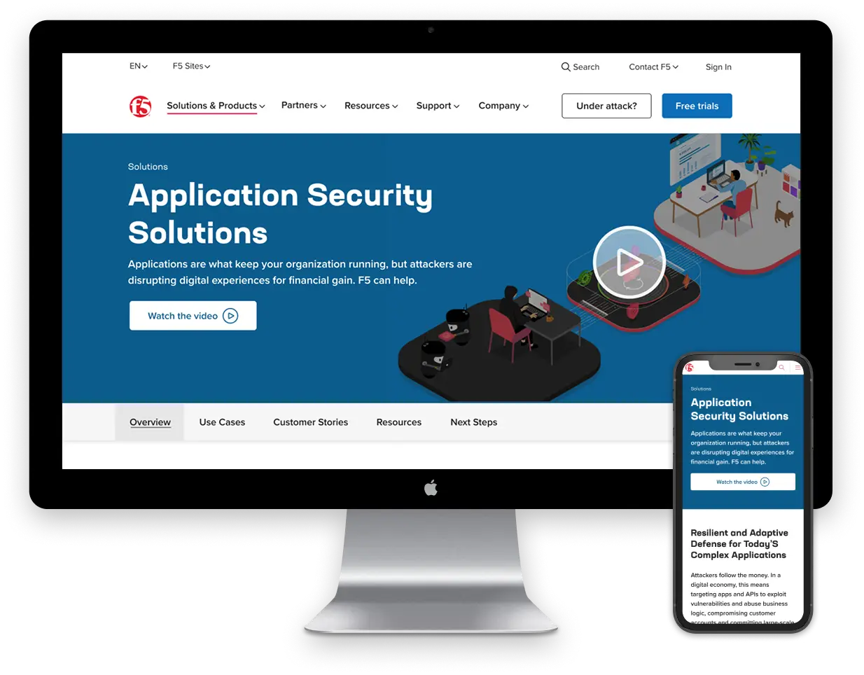
F5, a global leader in multi-cloud application security and delivery, recognized the need for a comprehensive digital transformation of their web presence to better align with their evolving product strategy, diverse customer base, and rapidly growing portfolio through acquisitions like NGINX, Volterra, and Shape Security.
Their vision was bold: to deliver a seamless, personalized, and accessible digital experience across all properties, elevate their brand and go-to-market strategy, and optimize content for discoverability and engagement.
F5
Building a Unified Digital Experience: F5’s Transformational Partnership with UpTop
Background
Challenges
F5 faced several interwoven challenges:
- Fragmented user journeys across multiple domains and brands
- Accessibility gaps for users with disabilities
- Lack of internal alignment around content strategy and product taxonomy
- Low visibility into performance of navigation and IA structures
- Disjointed design systems and inconsistent publishing practices
- The need to merge newly acquired properties into a cohesive experience
Partnership Info
client
F5
Industry
Enterprise Software / Networking / Cybersecurity
type
Website Redesign, UX Strategy & Research
services
UX Research, Envisioning, Accessibility Audits, UX/UI Design, Prototyping, Strategy Workshops
Partnership Info
client
F5
Industry
Enterprise Software / Networking / Cybersecurity
type
Website Redesign, UX Strategy & Research
services
UX Research, Envisioning, Accessibility Audits, UX/UI Design, Prototyping, Strategy Workshops
Background
F5, a global leader in multi-cloud application security and delivery, recognized the need for a comprehensive digital transformation of their web presence to better align with their evolving product strategy, diverse customer base, and rapidly growing portfolio through acquisitions like NGINX, Volterra, and Shape Security.
Their vision was bold: to deliver a seamless, personalized, and accessible digital experience across all properties, elevate their brand and go-to-market strategy, and optimize content for discoverability and engagement.
Challenges
F5 faced several interwoven challenges:
- Fragmented user journeys across multiple domains and brands
- Accessibility gaps for users with disabilities
- Lack of internal alignment around content strategy and product taxonomy
- Low visibility into performance of navigation and IA structures
- Disjointed design systems and inconsistent publishing practices
- The need to merge newly acquired properties into a cohesive experience
“The UpTop team is great. They’ve been flexible…and…I really appreciate the transparency when we are working together.”- Director of Digital Marketing, F5 Networks
Approach
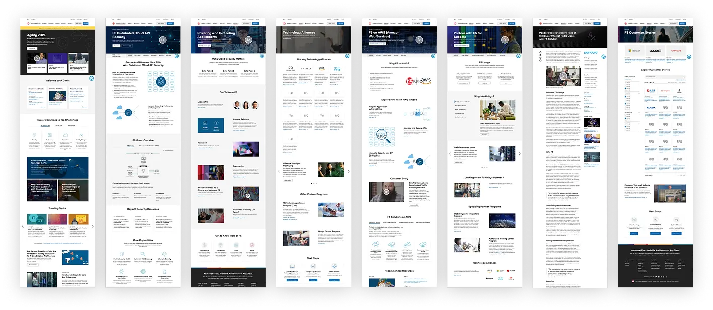
UpTop led:
- Stakeholder interviews and alignment workshops to define a unified product vision and taxonomy
- Heuristic evaluations, user testing, and journey mapping
- Analytics and competitive benchmarking
- Creation of flexible design systems and UI kits
- Prototypes and A/B testing frameworks to validate solutions
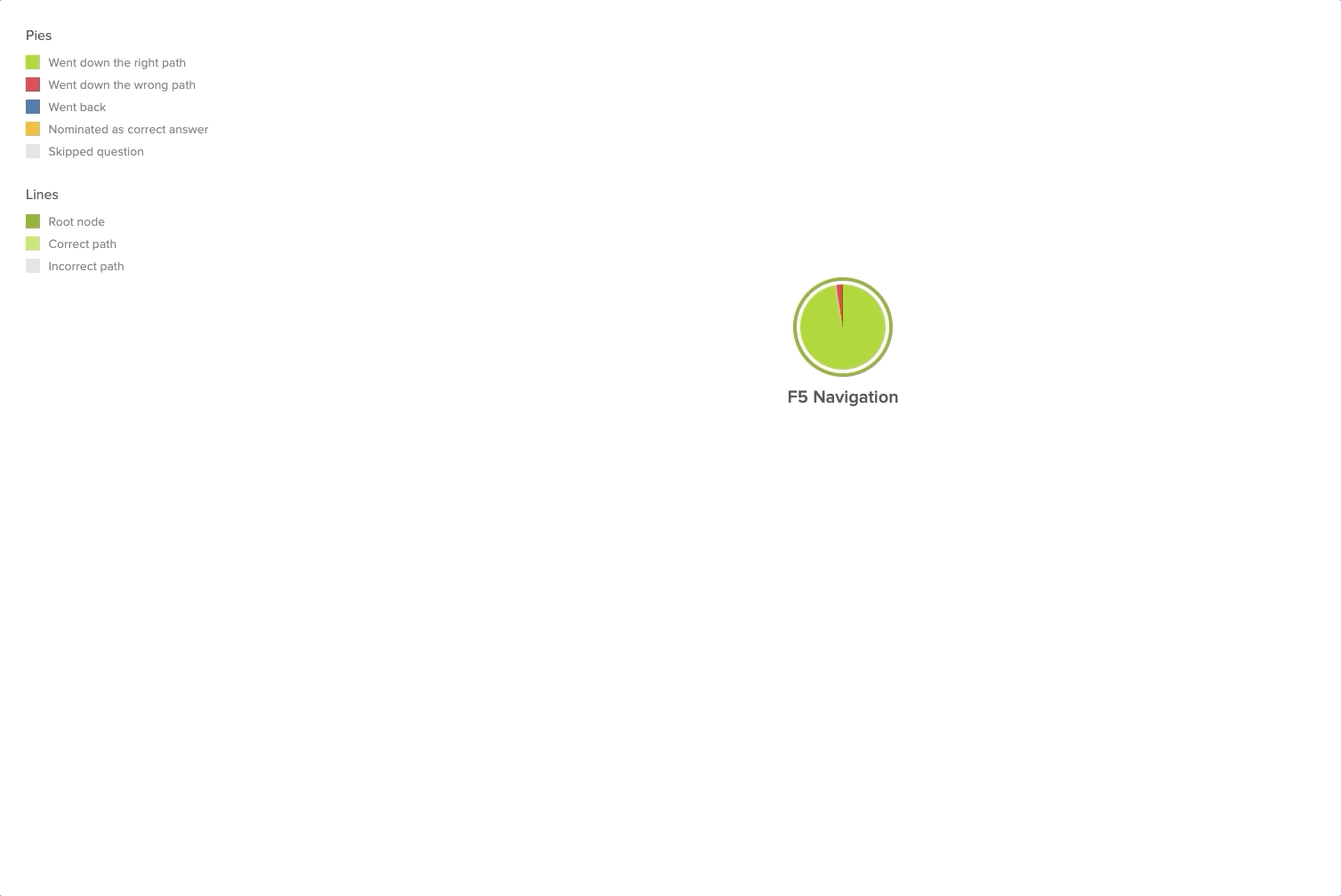
Tree Test Pie Tree: View product page for BIG-IP Virtual Edition.
Solution
UpTop delivered high-impact solutions across multiple fronts:
- Conducted a full accessibility and inclusion audit, producing actionable UX recommendations for F5.com and associated sites like DevCentral and NGINX
- Redesigned the NGINX.com site to prioritize developer experience with modern, responsive UI
- Created an interim integration of Volterra into F5.com to maintain brand consistency
- Defined and prototyped a unified navigation system for F5’s digital ecosystem Led envisioning and design efforts to centralize and personalize the user experience across web properties, tailoring paths for key personas
- Partnered in live user testing at F5's AppWorld event to collect real-time feedback on IA/navigation structures
Results
- Enabled the consolidation of multiple digital properties into a single cohesive user experience
- Improved accessibility compliance and inclusive design practices, setting a new internal standard
- Built stakeholder alignment across Product, Brand, GTM, and Demand teams
- Developed flexible design assets, empowering internal teams to scale future experiences
- Supported a shift toward data-driven decision-making in UX through structured testing and analytics
The multi-year collaboration has positioned F5 to deliver a best-in-class digital experience that reflects its innovation leadership in the cloud and security space.
Related Case Studies
Related Case Studies
Let’s Build What’s Next. Together.
From creating innovative new products to elevating existing experiences, UpTop is ready to help you make it happen.