


In the world of design, success often depends on understanding not just what users do but why they do it. At its core, great user experience design is about reducing friction; making it easier for people to achieve their goals. But what if I told you the key to unlocking higher conversions lies in understanding how the brain works? Specifically, the two modes of thinking it engages in: one lazy, one hardworking.
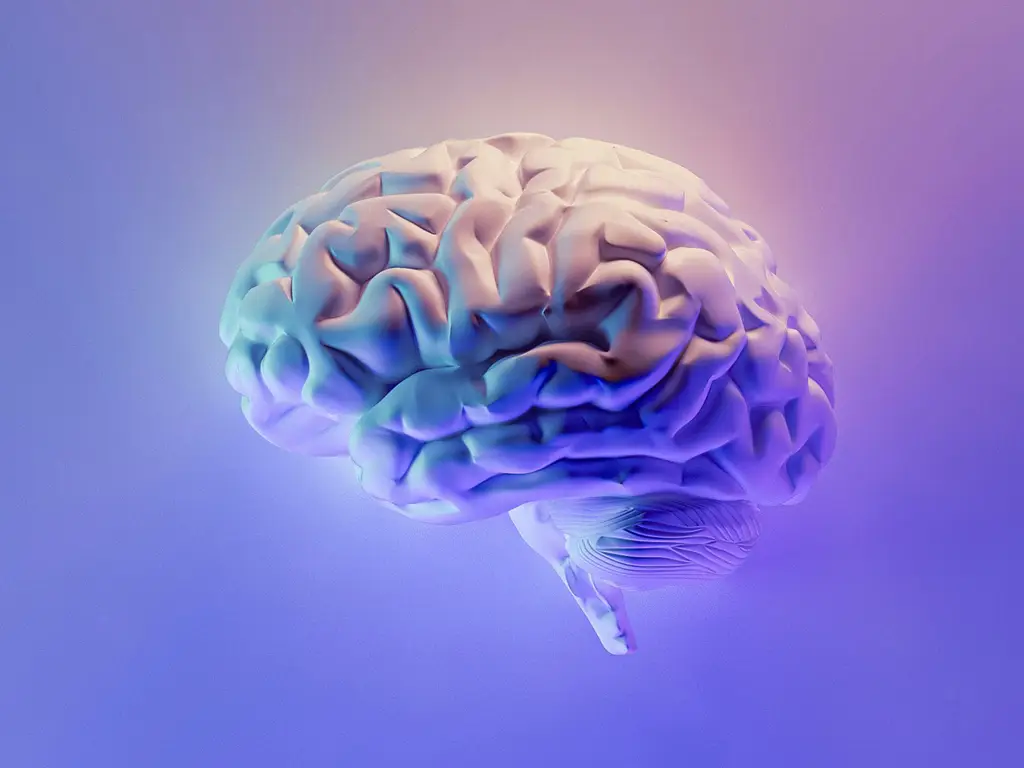
Daniel Kahneman, in his groundbreaking book Thinking, Fast and Slow, coined these two modes of thought as “System 1” and “System 2.” System 1 is fast, intuitive, and automatic; it’s what I like to call the “lazy brain.” System 2, on the other hand, is deliberate, analytical, and effortful; the “working brain.” While both systems are constantly active to some degree, our brains naturally prefer the lazy state because it conserves energy and reduces cognitive strain.
From a design perspective, this insight has profound implications. When your goal is to convert users—whether by making a purchase, signing up for a service, or completing any other desired action; keeping their brains in “lazy mode” can make all the difference. Why? Because the moment you force users into “working mode,” you risk losing their trust, confidence, and ultimately, their willingness to follow through. Let’s unpack why this happens and how you can design experiences that tap into the subconscious to drive conversions.
The Perils of the Working Brain
The working brain activates when users face uncertainty, encounter problems, or are presented with complex tasks. While System 2 thinking is essential for activities like solving math problems or evaluating pros and cons, it’s not what we want users to engage in when interacting with your website or app.
When the working brain is triggered, users become more cautious and analytical. They may:
- Feel overwhelmed. Too many options or unclear pathways can lead to decision paralysis.
- Lose trust. Unfamiliar terms, inconsistent design, or hidden fees can erode confidence.
- Explore competitors. The more effort required to understand your offering, the more likely users are to abandon your site for a simpler, more intuitive alternative.
In short, forcing users into working mode introduces friction, and friction is the enemy of conversion. Instead, our goal as UX designers is to engage the lazy brain, System 1, by leveraging cognitive and psychological principles that align with how people naturally think and behave.
Designing for the Lazy Brain
So, how do we keep users in lazy mode? By reducing cognitive strain and creating experiences that feel intuitive, effortless, and even enjoyable. Here are some actionable strategies:
- Simplify Navigation
Cluttered or confusing navigation is a common culprit behind user frustration. Your navigation should feel like second nature to users, guiding them seamlessly to their goals. Stick to familiar terms and logical structures. For example, when we redesigned the BabyLegs e-commerce website before its acquisition by United Legwear, we discovered that navigational issues were a significant barrier to conversion. The previous design relied on creative but unconventional labels that left users guessing. By streamlining the navigation and using straightforward, familiar terms, we not only increased conversions but also turned low-performing products into top sellers. - Limit Redundant Choices
Choice is a double-edged sword. While offering options can empower users, too many choices can overwhelm them, a phenomenon known as “choice paralysis.” Resist the temptation to add links or features that serve no real purpose other than making the interface look “busy.” Instead, focus on guiding users toward the most relevant and valuable actions. By prioritizing clarity and simplicity, you’ll help users make decisions more confidently; without triggering their working brains. - Leverage Gestalt Principles
The human brain craves order and patterns. By using Gestalt principles, such as proximity, similarity, and contrast, you can create designs that feel harmonious and intuitive. These principles help users process information quickly, reducing the need for conscious effort.For instance:
- Proximity: Group related items together to signal their connection (e.g., placing product images, descriptions, and “Add to Cart” buttons in close proximity).
- Similarity: Use consistent fonts, colors, and styles to establish visual patterns that users can easily follow.
- Contrast: Draw attention to key elements, such as call-to-action buttons, by making them stand out through size, color, or placement.
- Build Trust Through Familiarity
Trust is the foundation of conversion. When users feel confident in your website or app, they’re more likely to take the desired action. Familiarity plays a key role here. Use recognizable design patterns and language to make your experience feel approachable and reliable. For instance, if your audience is accustomed to seeing a shopping cart icon in the top-right corner of e-commerce sites, don’t reinvent the wheel by placing it elsewhere. Consistency builds trust, while unnecessary creativity can breed confusion. - Tell a Clear Story
Humans are natural storytellers, and the lazy brain loves a narrative. Crafting a compelling, user-centered story can guide users through your site or app in a way that feels effortless and engaging. Use visual hierarchy, microcopy, and imagery to create a narrative arc that aligns with your users’ goals.For example, on a landing page, the story might unfold like this:
- Headline: Clearly state the value proposition.
- Supporting Copy: Address pain points and highlight benefits.
- Call-to-Action: Provide a straightforward next step.
- Test and Iterate
Even the best design principles need to be tested. Conduct usability testing to identify pain points and observe how users interact with your product. A/B testing is also invaluable for optimizing conversions. Small changes, such as tweaking button text or adjusting the placement of a form, can have a big impact on user behavior. At UpTop, we’ve seen firsthand how iterative design improves outcomes. By continually refining based on user feedback, we ensure that every experience we create feels intuitive and effective.
Why Lazy Brains Equal Happy Users
The beauty of designing for the lazy brain is that it doesn’t just boost conversions; it also enhances the overall user experience. When users can navigate your site or app effortlessly, they feel in control and empowered. This positive emotional state increases satisfaction and loyalty, turning first-time visitors into repeat customers.
Remember, the goal isn’t to trick users into making decisions but to remove unnecessary barriers that stand in the way of their goals. By respecting how the brain works, you can create experiences that feel natural, trustworthy, and rewarding.
Final Thoughts
Designing for the subconscious is both an art and a science. By tapping into cognitive principles and leveraging the power of the lazy brain, you can create experiences that drive conversions while delighting users. As Head of Design at UpTop, I’ve seen how these strategies transform businesses, turning digital touchpoints into powerful tools for growth.
So, the next time you’re designing a website, app, or any digital product, ask yourself: Are you keeping the lazy brain in charge? If not, it might be time to rethink your approach. After all, the path to conversion is paved with intuitive, effortless experiences.
If you’re ready to create intuitive, high-converting digital experiences for your business, connect with UpTop today. Let’s work together to design solutions that tap into the subconscious and deliver measurable results.