


In our previous articles, we talked about different industries and how advancements in technology can result in more value when done right. In this article, we will focus not just on one industry, or even one solution, but on the design of a single web page that can make or break your business – payment checkout pages.
Today, the eCommerce industry is bigger than ever. According to Insider Intelligence, US eCommerce sales will exceed $1 trillion for the first time ever in 2022. This market has a lot of potential for new players, not just giants like Amazon or eBay.
If you are reading this article, you are probably already in this industry or in an active development process of your own eCommerce store. There are multiple challenges to overcome in this industry, and one of them is shopping cart abandonment.

The importance of effective payment checkout pages
Baymard Institute discovered that almost 70% of online shopping carts are abandoned. Dynamic Yield claims that eCommerce stores lose $18 billion in sales revenue each year because of this factor.
Shopping cart abandonment happens the most on mobile devices:
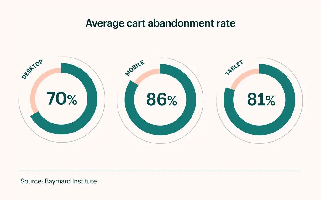
Why does this happen? Baymard Institute conducted the research, and got the following results:
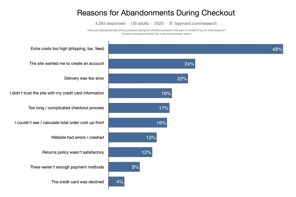
As you see, a checkout process UX that is too long and complicated got 17%, the inability to calculate total order cost up-front got 16%, and the lack of payment methods got 9%. An optimized and carefully designed eCommerce checkout page can eliminate those problems, and potentially reduce the shopping cart abandonment rate for your store by more than 40%! In this article, we will discuss how to implement methods to help you increase the revenue for your business thanks to effective checkout page design.
The development approach to shopping cart page design
Before going any further, it is important to mention the development approach of your eCommerce website can be a deciding factor in the functionality you can add. You must decide for your business what is really important, and pick the development approach that will cover your needs.
There are three popular options:
- You can pick one of the website builders like Wix or WordPress, and adjust it according to your needs. Some modifications will be harder to implement than others, and some features could be impossible with this approach.
- You can use a specialized eCommerce platform like Shopify and create your store there. It will be somewhat limited in terms of customization but will offer you basic functionality.
- You can go with custom software development, and build your eCommerce store from scratch. This is the most expensive option, but it will offer you maximum customization and enable you to set up the eCommerce checkout flow you want.
Each of these options in different scenarios may be more suitable than the other. Just keep in mind that for some functions in the eCommerce checkout design that we will mention below, you may need the help of the external development team.
What are the goals of your checkout page?
The goal of an effective checkout page design is to sell goods easily, with minimal shopping cart abandonment percentage. To this end, there are some important questions you should answer in order to set goals for your page and get the most value for your business.
What type of business do you operate?
For a typical eCommerce website, the main goal is to encourage customers to complete their purchases. However, you may have a business or service that can earn revenue from additional sales, like a brewery that sells merchandise in addition to beer, or a barbershop that can offer services in addition to what the client ordered. Understanding the goals of your customers and what you want to sell will help you with checkout designs. More often than not, just copying the checkout process from a successful example will not cut it.
Do you need additional engagement?
The journey of your users might not stop after the checkout. You may also include a “Thank You” page or call-to-action button to subscribe to your newsletter, blog, or follow your social media. You can use this as an additional opportunity for customers to engage with your business and return to buy your product or services in the future.
Determining metrics
After you set your goals, you need to have specific and tangible metrics to evaluate the performance of your page and be able to make adjustments accordingly:
- Set a specific goal, for example selling 10 particular products in 7 days
- Set a percentage of abandoned carts you want to reduce
- Be honest and realistic, make sure to set achievable goals
- Your checkout page goals must be aligned with your business
To get those metrics you can use Google Analytics which has an e-commerce package, or other tools like Glew and Supermetrics.
“Overall the web is pretty sloppy, but an online store can’t afford to be.”
— Paul Graham, co-founder of Y Combinator
Checkout page design: What are the key elements?
Before diving deep into eCommerce checkout best practices, let’s review the core elements which you will encounter during the checkout process design. The entire flow begins when the user clicks “Add to cart” and finishes after payment is complete and confirmation and a “Thank you’’ message appear.
You need to create a checkout UX design in a way that will keep buyers engaged through all pages and their journey won’t end up with a shopping cart abandonment.
Add to cart
This is the first step, from which every checkout process UX begins. When the user adds an item to a cart, it shows a clear intention to buy a product and indicates that you’ve done everything right in the pre-checkout stages.
Billing information
On this page, you should display a well-structured receipt with detailed product information, price, shipping costs, and additional expenses like taxes, as well as a total amount for purchase. It is very important to display the final price here because if you don’t, you might scare off a potential buyer when you charge more during payment confirmation.
Shipping information
This part is all about the delivery information. Your potential buyer should be able to easily enter a shipping address, category of shipping, type of delivery, etc. It is important for eCommerce checkout UX to do it right, and don’t make users re-enter this information when a certain mistake is done that prevents them from going to the next page.
Shopping method
At this stage, users choose the type of payment. It can be online payment, internet banking, online wallets, or cash on delivery.
Secure payment
If the buyer didn’t choose the cash method, we move to this stage. This is probably the most important page since we are dealing here with a client’s money. Typically, the payment process goes through adding credit card details, verifying the purchase through a one-time password, and then confirming the payment.
A confirmation message and “Thank You” page
While it may seem optional, a “Thank You” message, as well as an instant email confirmation of the order, is a must to end a purchase on a good note. You are not only showing your gratitude, but also confirming that the user did everything right during the process and there are no errors caused by the bad internet connection or technical problems with your website. In fact, today, it is an industry-standard and if users don’t get confirmation, there is a high chance that they may contact your support center soon.
Best checkout page design tips
Keep the information on your checkout page basic and easily understandable. It is best to avoid creating distractions, like pop-up ads, because some of your customers may fail to finish the checkout process.
One of the other important checkout best practices is to avoid multiple stages during the checkout process. Strive for a single-page checkout process, if it is possible in your case. If your process does take multiple steps, make sure to add a progress indicator that will keep customers aware of their current status.
In some cases, it makes sense to store the contents of the shopping cart and/or create an organized order history interface, as the customer might find it convenient to repeat the same purchase sometime later.
Overall, your checkout page must indicate what the customer is buying, what the final price will be, any applicable taxes or coupons, and what the accurate delivery date is. You can’t go wrong by creating your page starting with blocks containing that information.
Suggestions about the content
Speaking of content, while providing accurate information, you still can use some emotion here to connect with the customers and inspire the purchase. Depending on the case, it may be appropriate to use your creativity here and remind customers why they should buy your product or service.
If you have any extra fees, it will be a good idea to display them at the start of the checkout process, because no one likes to be surprised by extra costs at the end. Make sure that your page displays all shipping fees, taxes, and any other possible additional costs before a customer starts entering billing information. Additionally, it is important to add links to terms and conditions, privacy policies, and return policies. Make them easy to access from the checkout page to instill confidence in your customer that it is safe to buy from you.
Key design elements to consider and best practices
In this section, we will elaborate on the must-have elements of your page that will help to improve the overall user experience.
Reminders for abandoned carts
Customers sometimes leave the checkout process without completing a purchase. Functionality exists which allows you to remind your customers to consider revisiting their cart after they left your checkout page without completing the order. This could be achieved by automated messages on the platform or emails. There are multiple reasons to not complete the purchase, and friendly reminders might help to reduce the shopping cart abandonment rate.
Easy order modification
Make the process of changing the order during checkout as simple as possible and don’t make your customers work backwards, when avoidable.
Adding images
Always include accurate images of your product and services to remind customers what they’re about to purchase. A text list won’t look that attractive on your checkout page.
Focused CTA button
There are different uses of Call-to-Action buttons on your website, however, for the checkout page, it should lead a customer to a purchase. Place your CTA button in the most obvious place and don’t use any similar design conventions on the page to distract from the main CTA.
Internal links
While we already suggested that you should add links to terms and conditions, privacy policies, and return policies, you can also add a frequently asked questions (FAQ) section. It is not suitable for all cases, but an informative FAQ section can be beneficial for potential customers.
Chat support
It is also highly useful for your page to contain a live chat box that will help your customer to contact customer support quickly and easily when needed. You can have direct contact with your managers there, or even build a chatbot for automated replies if the number of potential requests will require this move.
Confirmation email
While seemingly obvious, sometimes, shop owners do not use this convenient tool that notifies customers they did everything correctly while placing their order. The absence of an instant confirmation email can make customers nervous and encourage some to double-check order details with your call center or customer support chat.
Shopping without registration
One of the reasons that might deter potential customers is the need to create an account before the purchase. Leave an opportunity for guest checkout, and offer users the option to register after the purchase in the email confirmation letter. Often users can be enticed to register by knowing they can review their order history, receive a coupon, or more easily create returns or repeat orders.
Payment options
The more payment options your website will have, the better. Popular website builders offer limited payment methods, like credit cards or PayPal. For some cases, you may need to include additional payment mechanisms to have a chance to stand out among competitors. In order to achieve that, consider hiring an experienced software development company in order to implement needed payment gateways and make them work properly with your platform.
Mobile optimization
The most popular website builders already include mobile website optimization of some kind. It’s increasingly more important to ensure the user experience on mobile devices is properly configured and not an afterthought in the development process. In order to make everything run smoothly, you should consider hiring developers that will help you to fine-tune the mobile checkout experience.
Trust badges
To further engender customer confidence, you can Include “trust badges” of security certificates and/or professional standards your website adheres to (Better Business Bureau, TRUSTe, VeriSign, etc), in order to show customers that they can trust you with their sensitive personal information.
Input error notifications
Professional checkout pages always include onscreen user feedback when the customer skips a mandatory field or enters information in the wrong format. When you notify your customers about errors only after they attempt to save the form and force them start to input the same data again, you risk losing their patience and patronage.
Pop-up/Modal windows
Carefully consider using this element in your design, as it may be annoying for a customer when done improperly. In-page modal windows can be used instead of popups to achieve a similar effect without the risk of software blocking the window. There still can be a great use for these in a post-checkout step, as you can thank your customer for the purchase and offer a discount for future purchases in the window.
Links to social media
The icons with links to your social media won’t hurt when they will be placed in the footer or header of your website, and not the actual checkout page. You can also place them in the “Thank You” message after the purchase. While your business’s feeds can be a great way to sell products or services, and you can’t wait to show them to your customers, make sure that they won’t distract any potential buyers.
Conclusion
There has been tons of research done on what goes into creating an effective payment page UX since eCommerce first took off about two decades ago. Consider reviewing checkout process best practices and see which ones are right for you and your business. A good place to start is the website of Baymard Institute, which contains a lot of research on what works and what doesn’t for particular businesses. The advice found there is much more than just copying Amazon, or using the largest eCommerce retailers as benchmarks; it’s a wise move to see what users may be familiar with when it comes to using certain patterns.
In addition to Baymard, it’s always good to do a landscape analysis of other companies in your industry, as well as outside your industry, to get a feel for what others are doing. Documenting this in a spreadsheet with defining criteria and screenshots is important to the research process. Hopefully, we’ve given you a head start on your research journey with this article. We’re here to help.
FAQ
What is a checkout page?
It is considered the experience on an eCommerce website after you click the ‘checkout’ CTA. This can be a single-page or multipage process. It usually encompasses signing in or checking out as a guest, entering billing and shipping details, and reviewing your purchase before submitting your order.
What is an optimized checkout page?
Optimizing a checkout page design involves reducing friction (steps and time) for the user as they complete their purchase. Amazon has patented the ‘1-click’ purchase approach, but for certain products/services and scenarios, it may not be that simple. Users may need to select a myriad of additional options before completing a transaction and the best practice is to organize those efficiently and provide a clear, logical checkout flow UX for your customers.
How to create a better checkout experience?
Determine which checkout UX design options are ideal for your customers and perform usability testing during the design phase to gather insights before going into development. If several patterns test well, and it’s hard to decide, develop a couple of options and perform A/B testing if you have the capability. This will allow you to get live customer data on which option performs better. To go the extra mile, consider doing multi-variate testing which is a whole other level of testing involving different combinations of elements and CTAs on the page. This may include variable text and image combinations and allows you to test multiple versions of page designs.
What is the best checkout process?
A great checkout process is streamlined, logical and where the user completes it without any friction. If the experience is easy for the user, they’ll be back.
What is the checkout process design?
The process of eCommerce checkout page design includes thought-out development of the key elements, including:
- Add to cart
- Billing information
- Shipping information
- Shopping method
- Secure payment
- A confirmation message and “Thank You” page
In order to get the best results, you need to work on of each of these elements of the process.